Back to portfolioPortfolio / TRI-M
TRI-M
Industrial brand identity
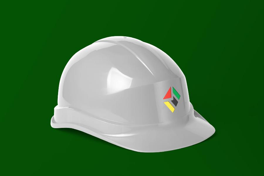
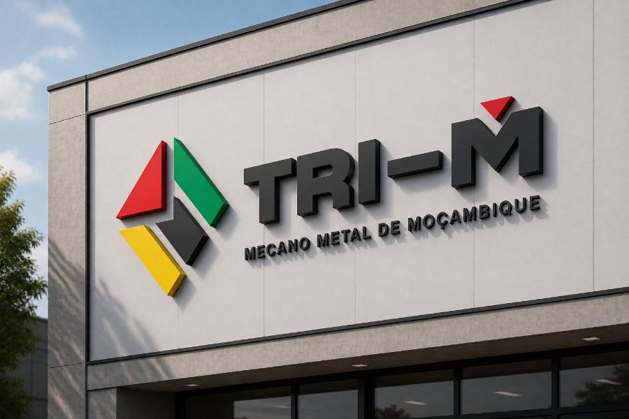
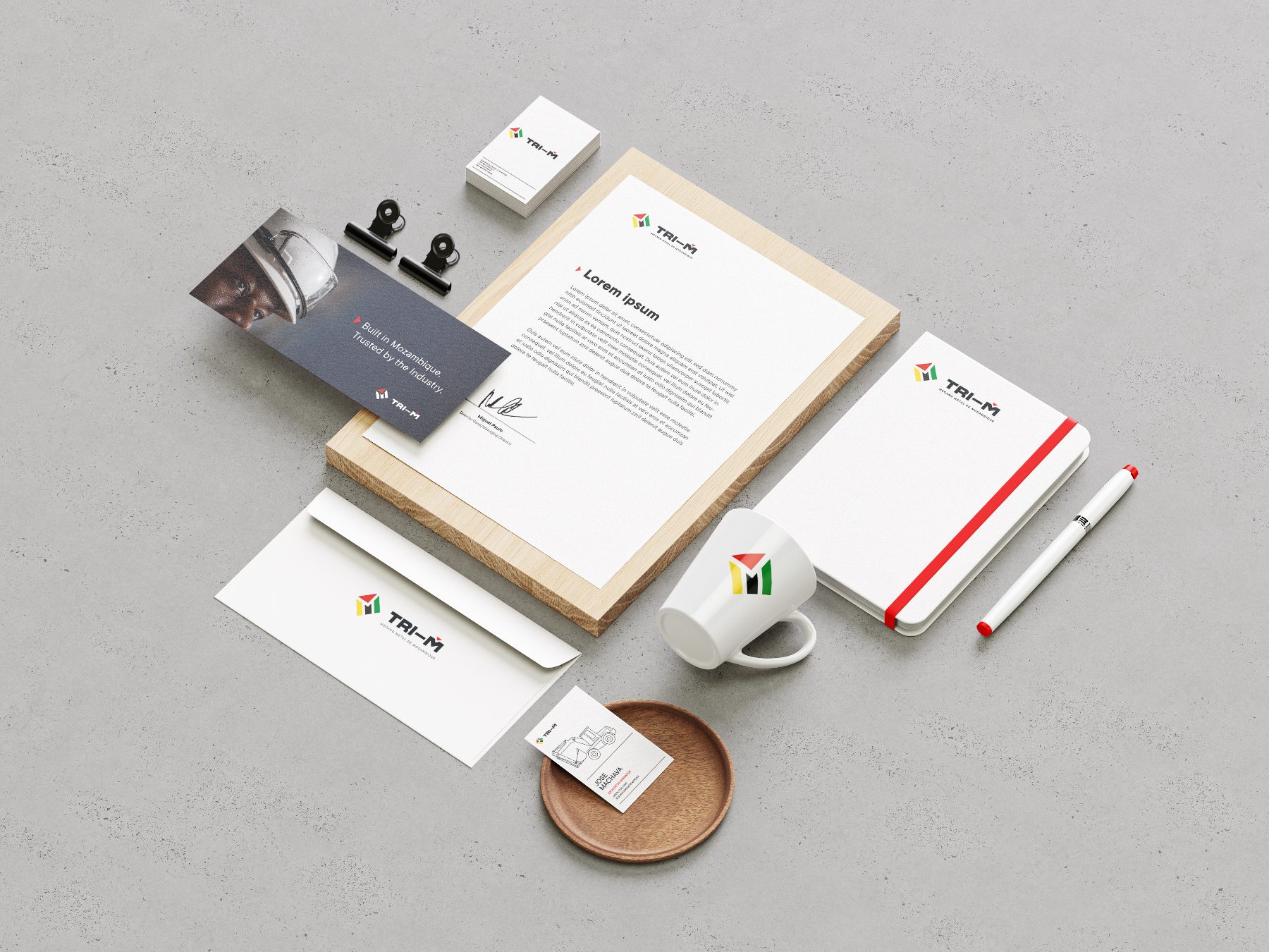
Built around the precision, transformation and movement of Mozambique’s metalworking industry. TRI-M’s geometric mark brings angled planes together like cut, folded and assembled metal components. Its solid construction communicates technical rigour, while red, green and yellow add energy and a subtle connection to Mozambique.
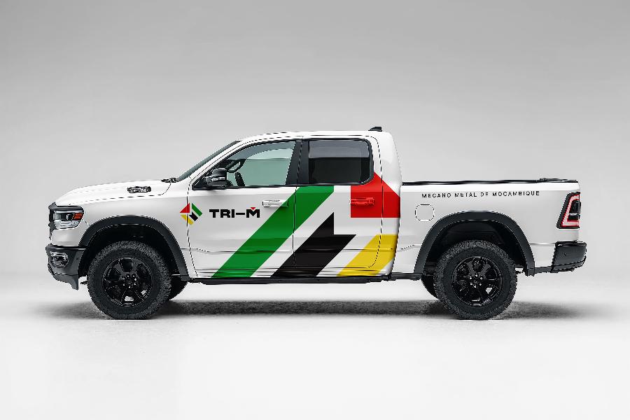
The identity system pairs a robust wordmark with TT Commons, a direct typographic voice and a palette grounded in charcoal. Colour and monochrome logo variants make the brand adaptable across corporate communication, equipment and physical spaces.
- Project
- Brand identity and design system
- Scope
- Logo system, typography, colour palette and application concepts
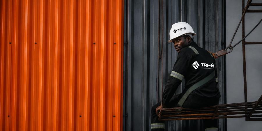
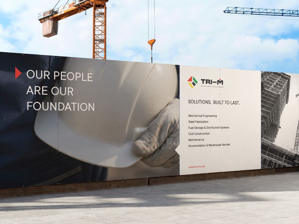
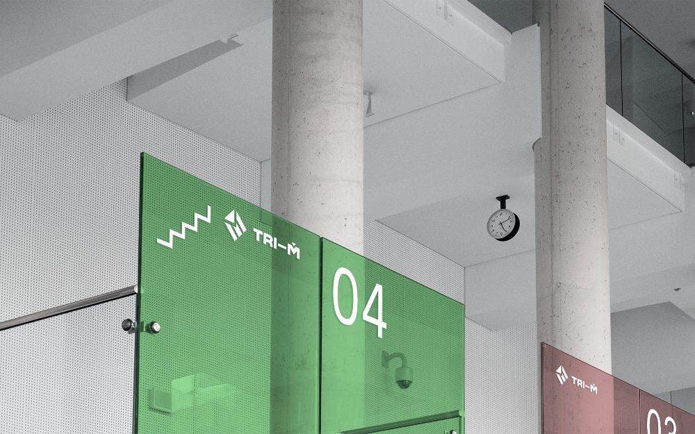
Identity in use.
Applications illustrated in the supplied brand system.